Belief Elicitation
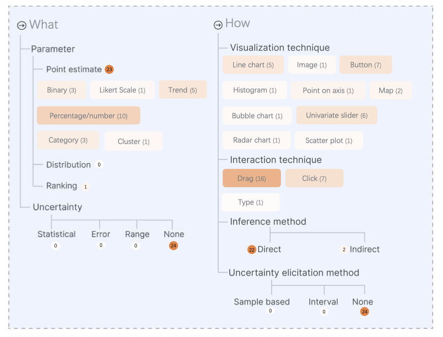
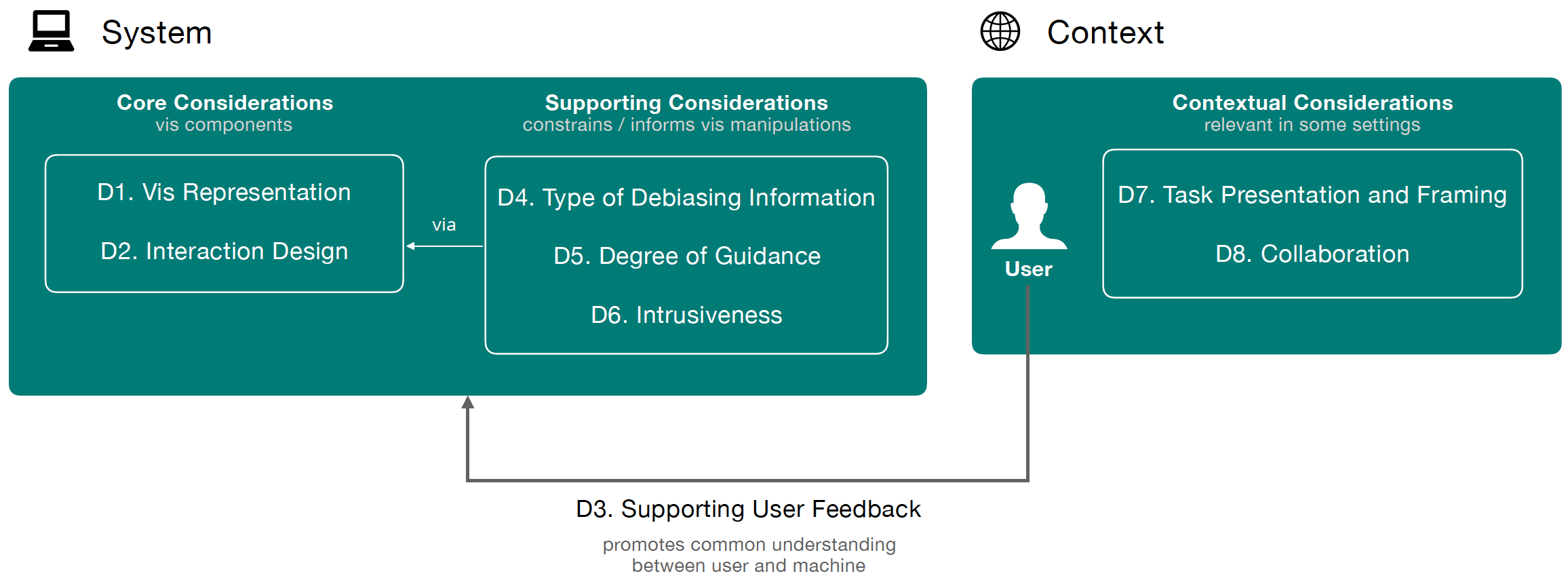
In this paper, we synthesize a design space for belief-driven visualizations based on formative and summative interviews with designers and visualization experts. The design space includes 7 main de- sign considerations, beginning with an assumed data set, then structured according to: from who, why, when, what, and how the belief is elicited, and the possible feedback about the belief that may be provided to the visualization viewer. The design space covers considerations such as the type of data parameter with optional uncertainty being elicited, interaction techniques, and visual feedback, among others. Finally, we describe how more than 24 existing belief-driven visualizations from popular news media outlets span the design space and discuss trends and opportunities within this space.
Check out the paper from EuroVIS 2022.

In this study, we recruit 101 participants to complete three tasks where beliefs are elicited immediately after seeing new data and again after a brief dis- tractor task. We conduct (1) a quantitative analysis of the results to understand if there are any systematic differences in beliefs elicited immediately after seeing new data or after a distractor task and (2) a qualitative analysis of participants’ reflections on the reasons for their belief update. While we find no statistically significant global trends across the participants beliefs elicited immediately v. after the delay, the qualitative analysis provides rich insight into the reasons for an individual’s belief movement across 9 prototypical scenarios, which includes (i) decay of beliefs as a result of either forgetting the information shown or strongly held prior beliefs, (ii) strengthening of confidence in updated beliefs by positively integrating the new data and (iii) maintaining a consistently updated belief over time, among others. These results can guide subsequent experiments to disambiguate when and by what mechanism new data is truly incorporated into one’s belief system.
Check out the paper from EuroVIS 2023.
Bias Detection
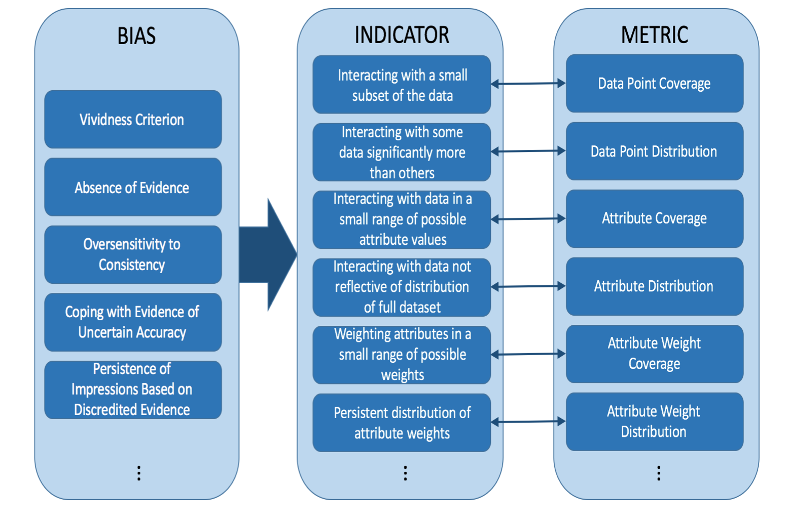
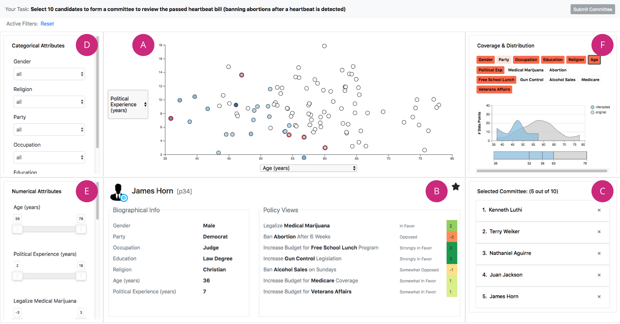
User interaction patterns are a powerful tool for making inferences about the person performing those interactions. In this paper, we introduce a set of metrics to statistically characterize those interactions according to how much they deviate from an "unbiased" distribution of interactions with the data using concepts of coverage and distribution. These metrics can be applied to real-time interactions with an interface to capture potential biases over time.
Check out the paper from IEEE VIS 2017.
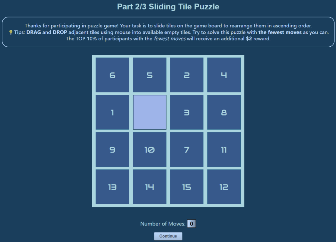
We demonstrate that the Dunning-Kruger Effect exists in a spatial reasoning task: the 15-puzzle game. Furthermore, we demonstrate that the effect leads to different patterns in user interactive behavior and has correlations with personality characteristics.
Check out the paper from the TREX Workshop at IEEE VIS 2022.
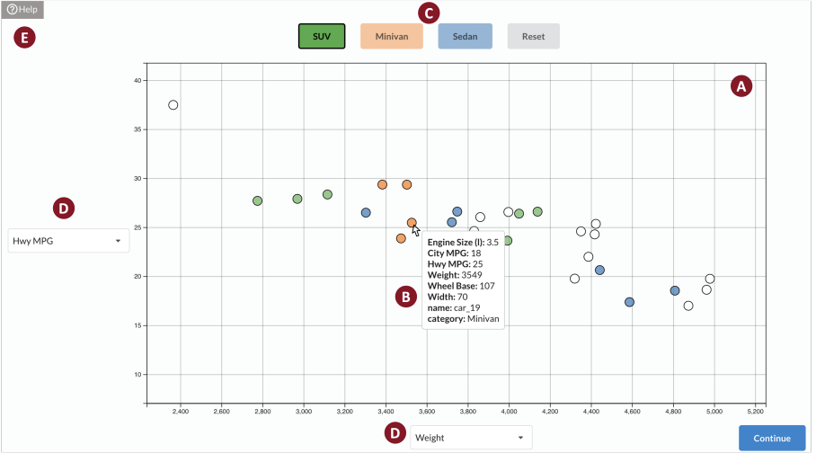
We explore if and how DKE manifests in visual reasoning and judgment tasks. Across two online user studies involving (1) a sliding puzzle game and (2) a scatterplot-based categorization task, we demonstrate that individuals are susceptible to DKE in visual reasoning and judgment tasks: those who performed best underestimated their performance, while bottom performers overestimated their performance. In addition, we contribute novel analyses that correlate susceptibility of DKE with personality traits and user interactions. Our findings pave the way for novel modes of bias detection via interaction patterns and establish promising directions towards interventions tailored to an individual’s personality traits.
Check out the paper from IEEE VIS 2024.
Designing Bias Mitigation Interventions
We derive a design space comprised of 8 dimensions that can be manipulated to impact a user’s cognitive and analytic processes and describe them through an example hiring scenario. This design space can be used to guide and inform future vis systems that may integrate cognitive processes more closely.
Check out the paper from IEEE VIS 2019.
We implemented one intervention, interaction traces, in the Lumos system and conducted a series of experiments to test the effectiveness.
Check out the Lumos paper from IEEE VIS 2021.
Check out the Left, Right, and Gender paper from IEEE VIS 2021.
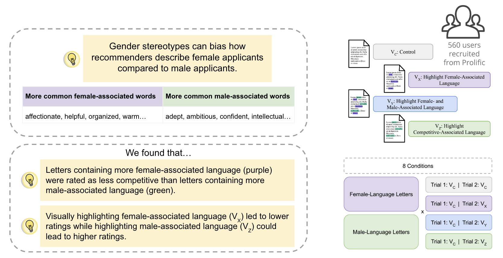
We conducted a crowdsourced experiment that showed biased language can have a negative impact on readers’ evaluations of candidates and visual highlighting of specific types of language in letters of recommendation has the potential to influence the evaluation of candidates. Specifically, we found that highlighting language more commonly used to describe female can negatively affect readers’ evaluation of candidates, while highlighting language more commonly used to describe male can reduce the effects of the bias.
Check out the paper from the VIS4Good workshop at IEEE VIS 2023.
Transformer-Based Interactive Literature Review
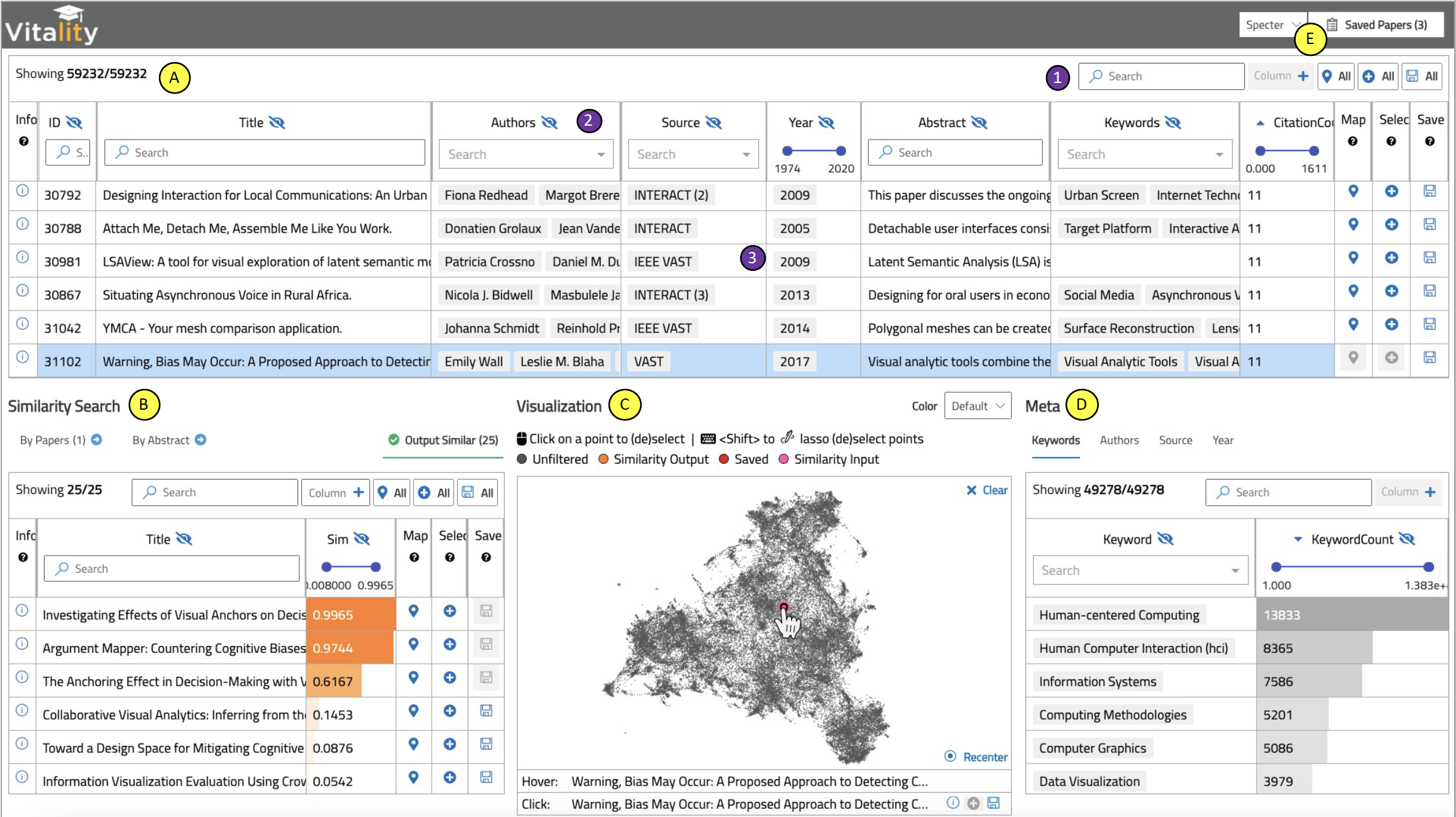
We developed an interactive table-based visualization for searching academic literature using a transformer-based approach. The system, VitaLITy, has an initial set of 59k articles from popular visualization venues. The open-source code can be augmented to search literature from other academic sources as well. An alternative to keyword searches, find semantically similar documents by providing a set of initial seed papers or providing a working paper title and abstract to kickstart the literature review of a new project idea.
Check out the paper from IEEE VIS 2021.
Check out VitaLITy 2.0 from the NLVIZ workshop at IEEE VIS 2024.
Try it out on the web.
Visualization Evaluation
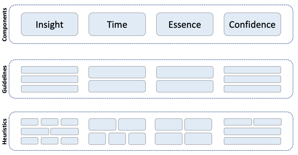
We create a heuristic-based evaluation methodology to accompany the value equation for assessing interactive visualizations. We refer to the methodology colloquially as ICE-T, based on an anagram of the four value components. Our approach breaks the four components down into guidelines, each of which is made up of a small set of low-level heuristics. Evaluators who have knowledge of visualization design principles then assess the visualization with respect to the heuristics.
Check out the paper from IEEE InfoVis 2018.
We describe the persistent tensions between various camps on the “right” way to conduct evaluations in visualization. Visualization as a field is the amalgamation of cognitive and perceptual sciences and computer graphics, among others. As a result, the relatively disjointed lineages in visualization understandably approach the topic of evaluation very differently. We explicate these differing expectations and conventions to appreciate the spectrum of evaluation design decisions. We describe some guiding questions that researchers may consider when designing evaluations to navigate differing readers’ evaluation expectations.
Check out the paper from IEEE CG&A 2022.